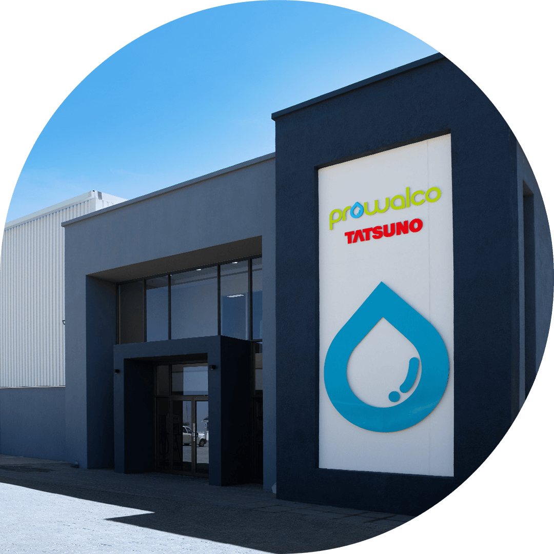
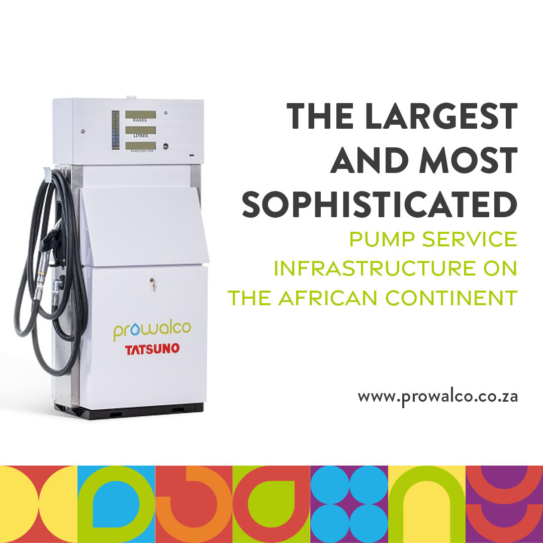
Prowalco is the sole African distributor of the Tatsuno Corporation range of pumps and dispensers manufacture by Tatsuno based in Japan. Prowalco also manufactures its own range of pumps and dispensers that are specifically designed for the African market.
I designed two full Corporate Identities for Prowalco to choose from.
Style 1
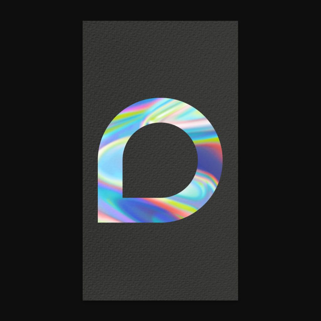
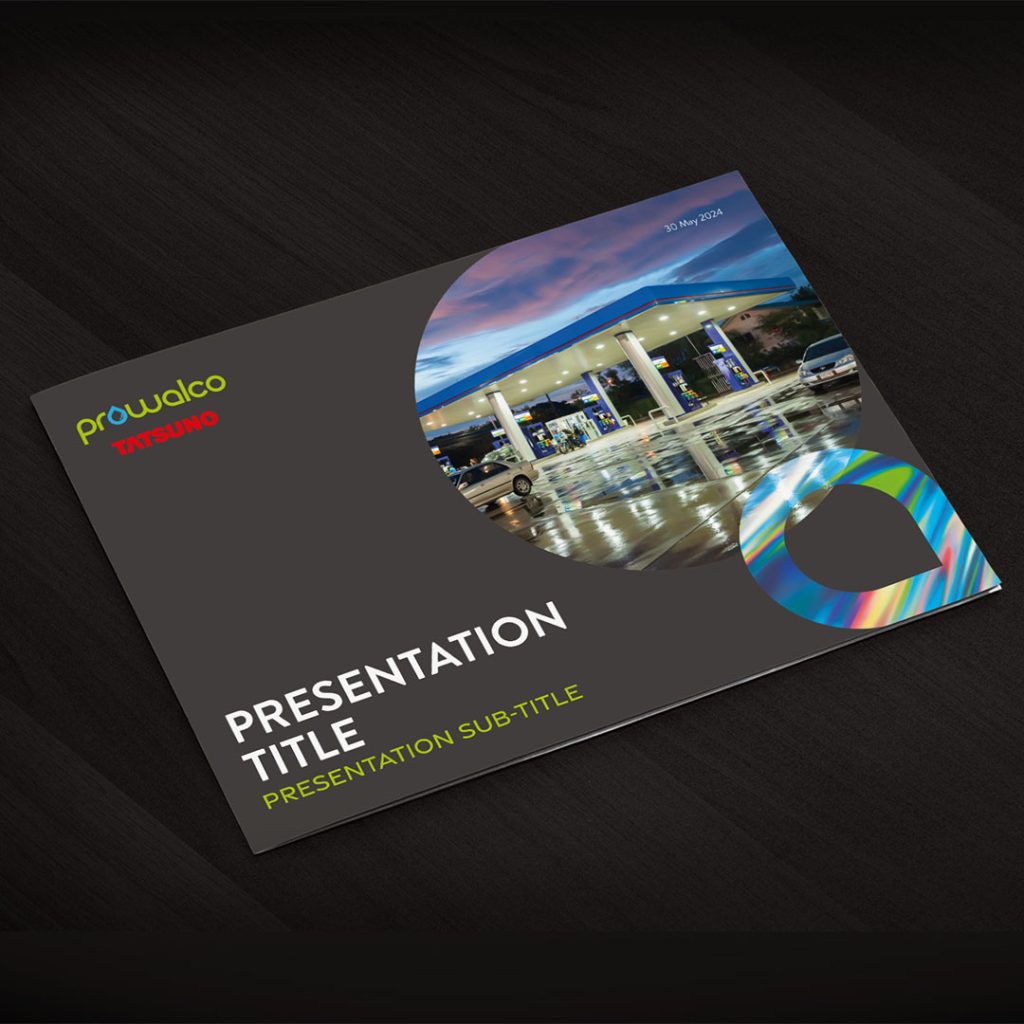
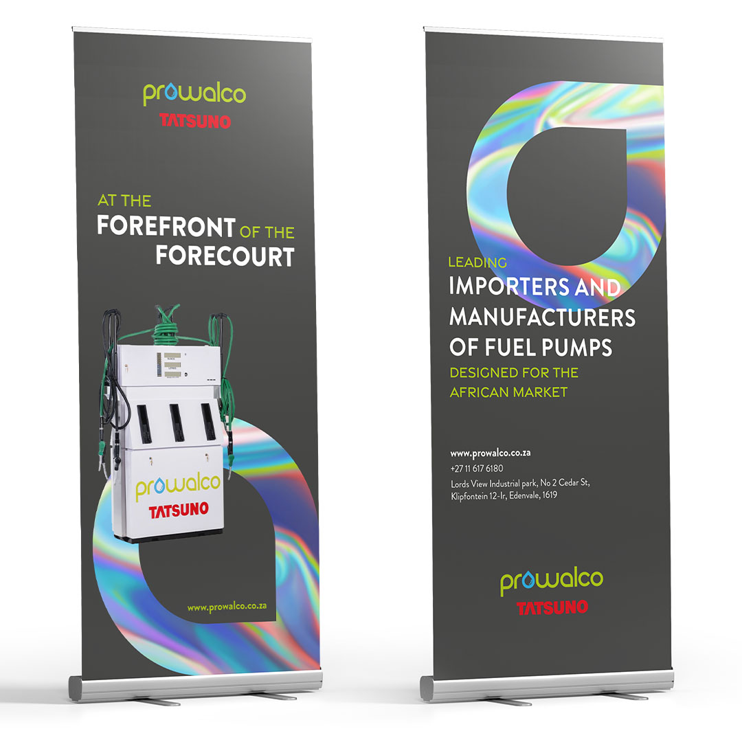
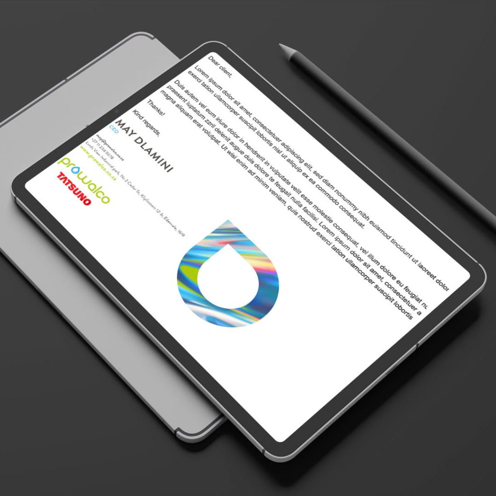
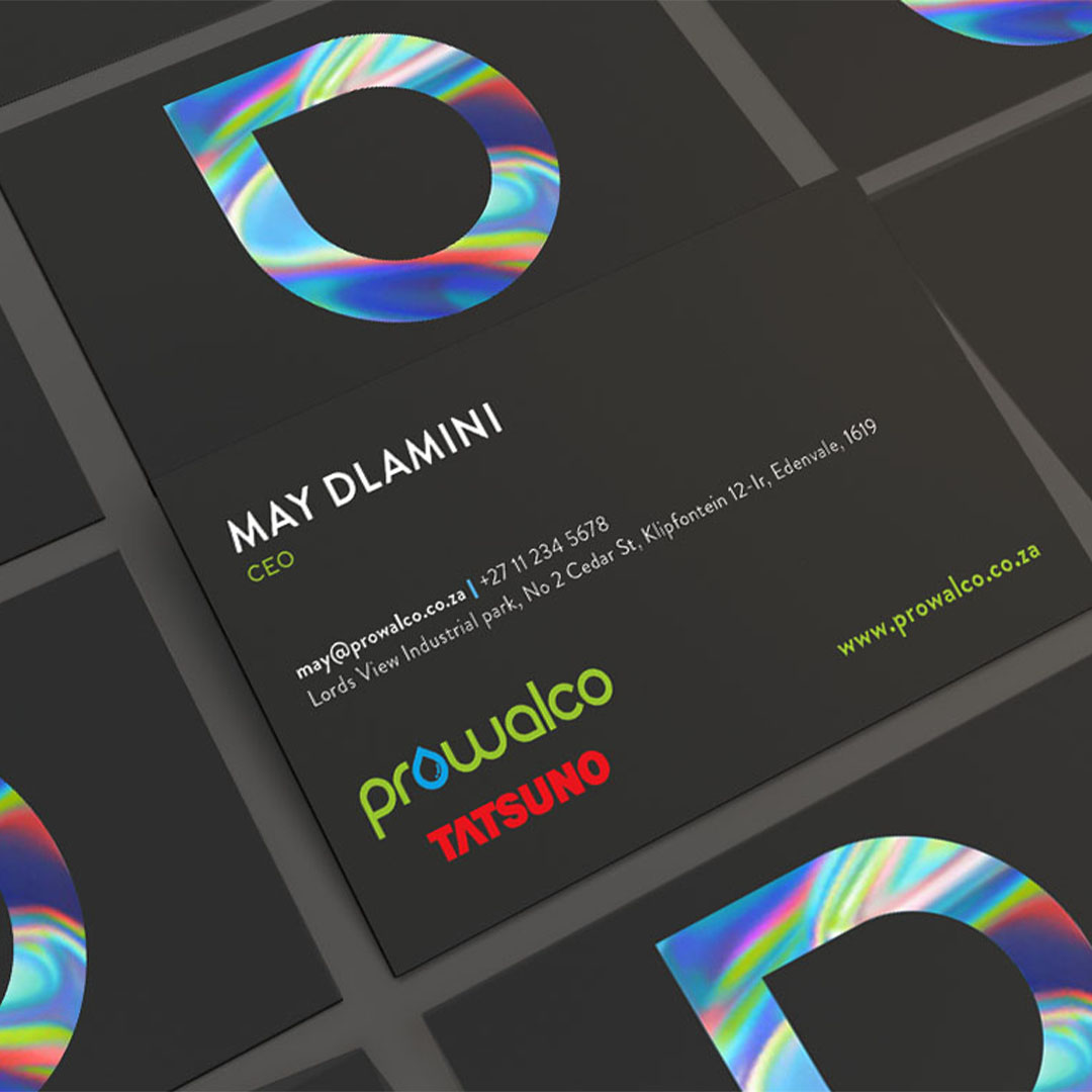
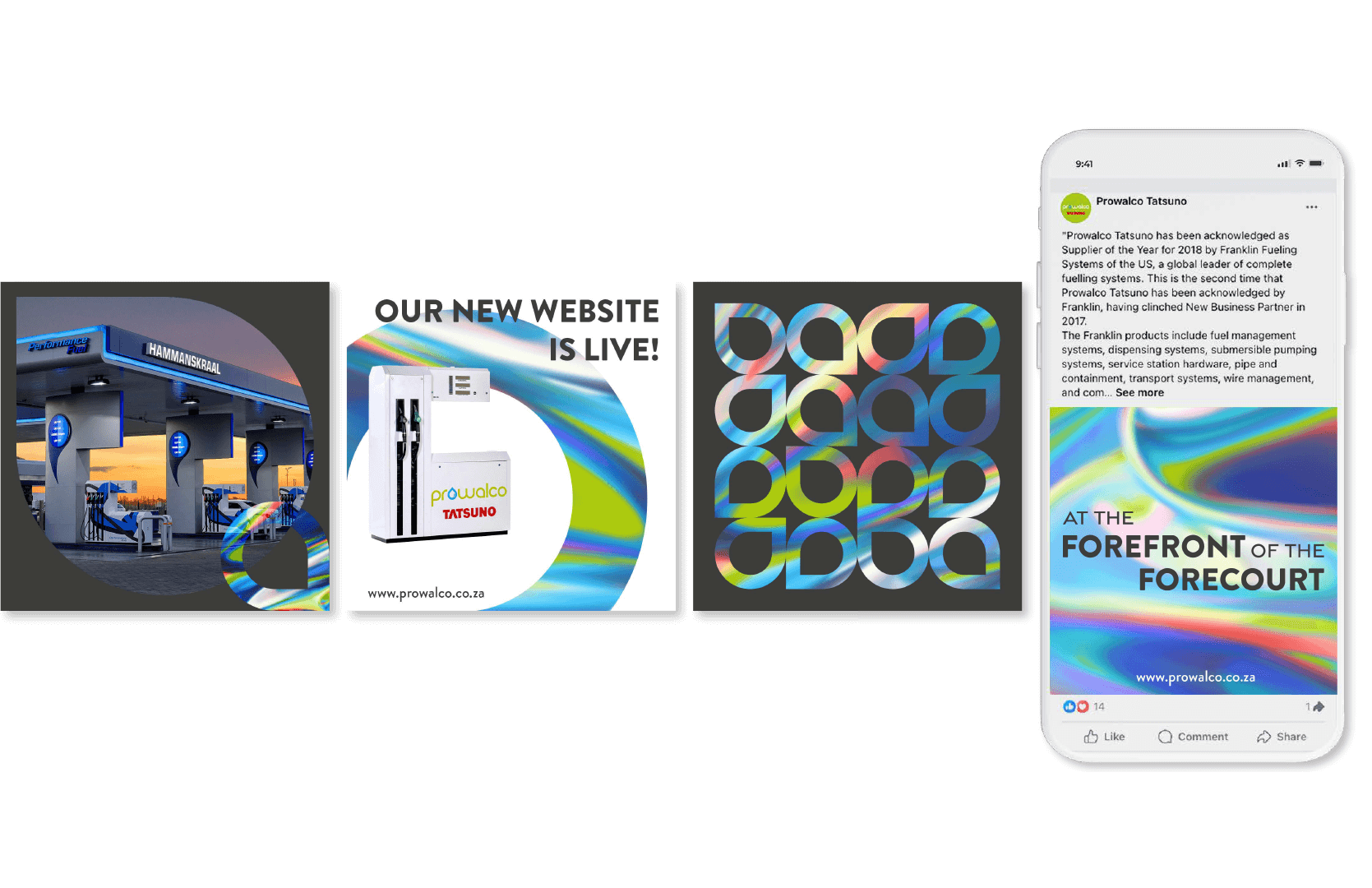
This design concept draws inspiration from the mesmerizing iridescence of fuel on water. This phenomenon, called thin-film interference, is transformed into a futuristic vision, with its shifting colors reimagined as a high-tech aesthetic. I combined this effect with a deep charcoal base, to create a sophisticated look. By turning the droplet icon that Prowalco is known for on its side, I modernised the Droplet icon. This dynamic design reflects the cutting-edge nature of the company and its commitment to innovation.
The visual identity extends seamlessly across all design deliverables. Clean design, a sophisticated colour palette, and clear fonts establish a modern tone. Clean layouts and impactful visuals aligs with the focus on innovation and allows Prowalco’s leading technology to take center stage. Subtle pops of the iridescent texture, integrated within the Prowalco icon, reinforce Prowalco’s visual style, and a commitment to cutting-edge advancements.
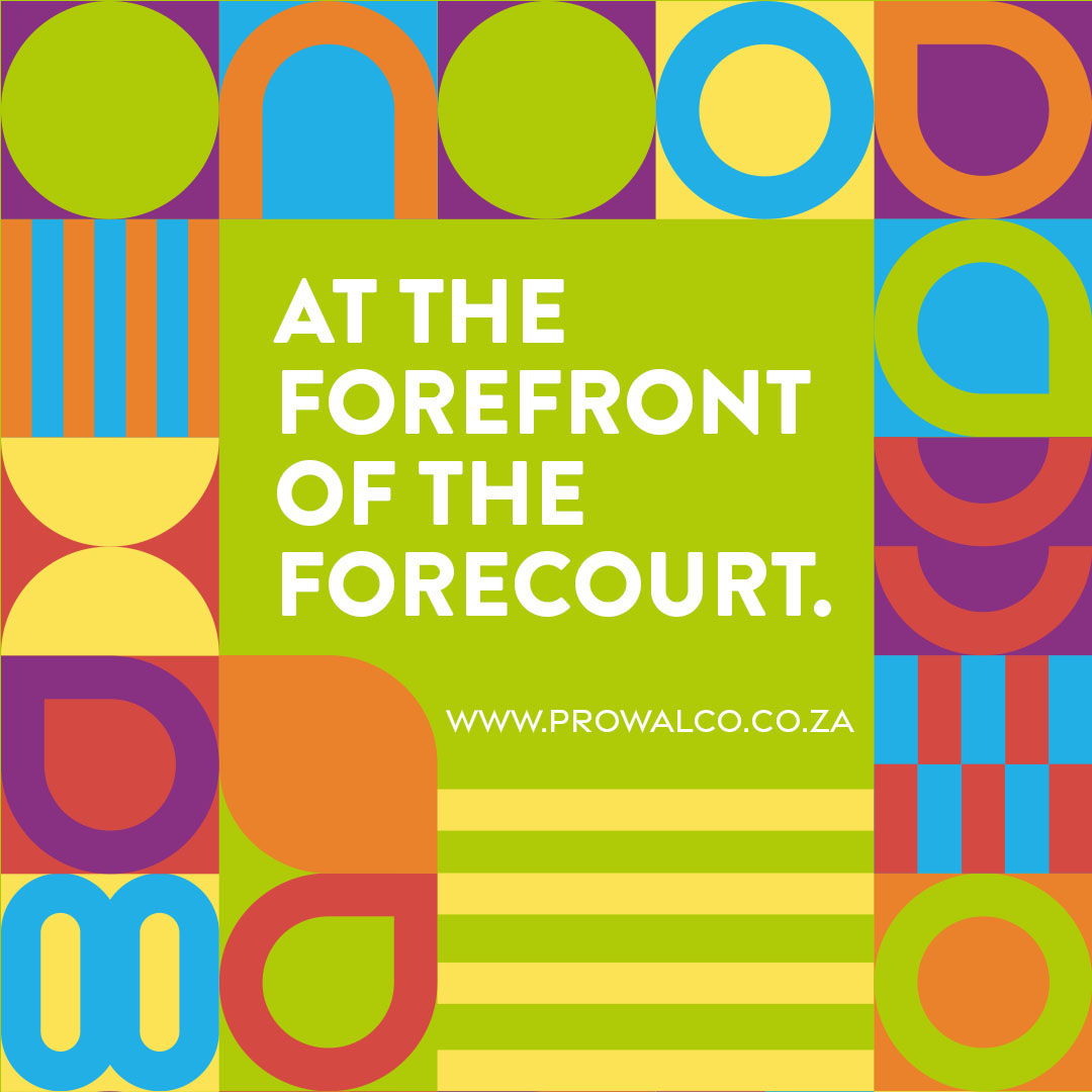
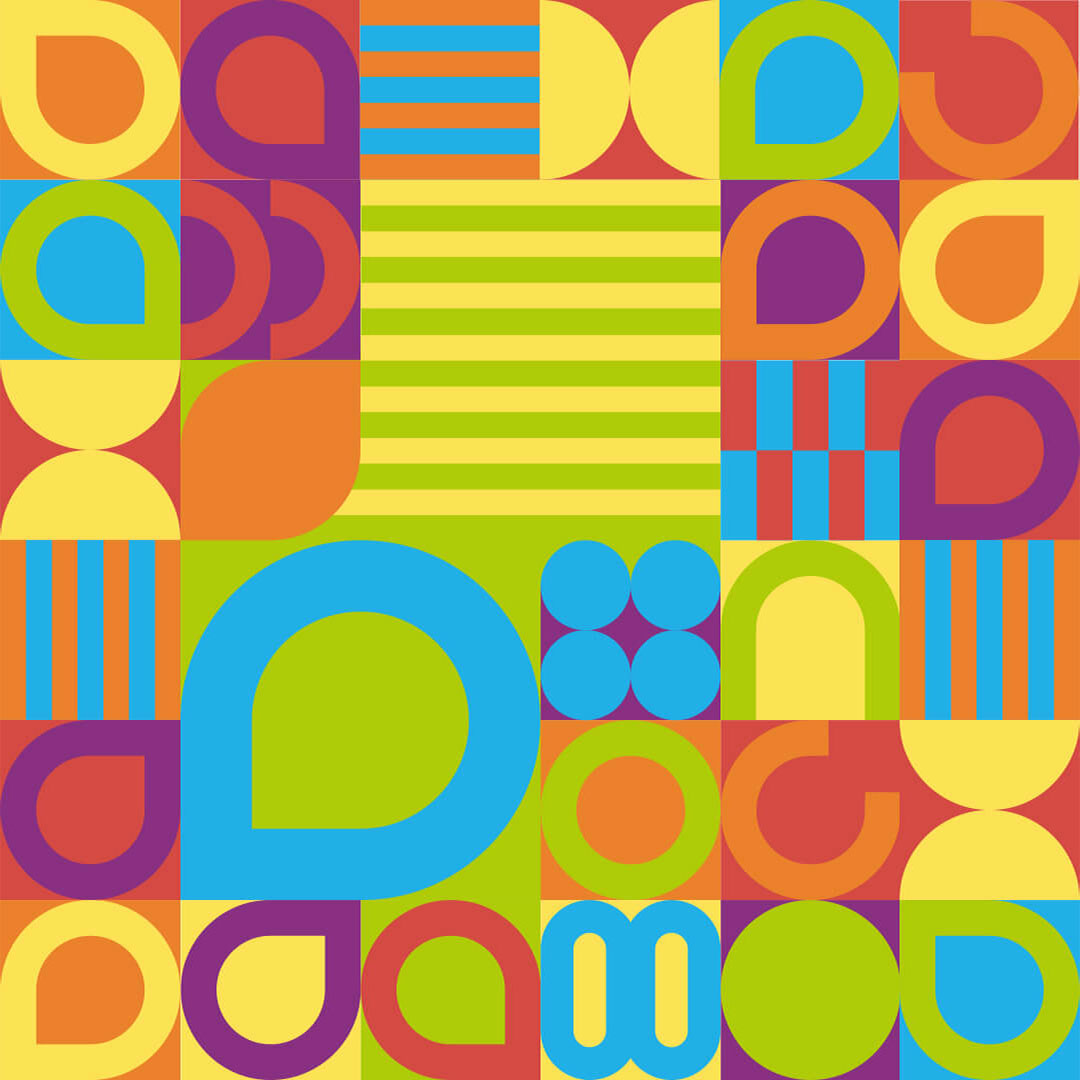
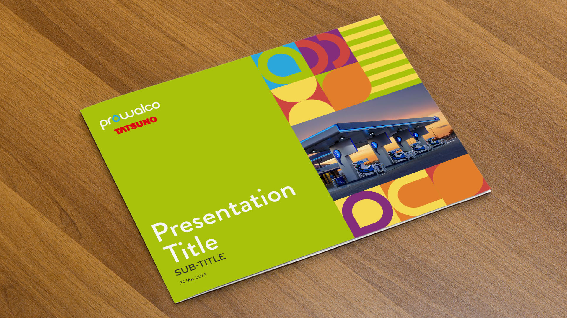
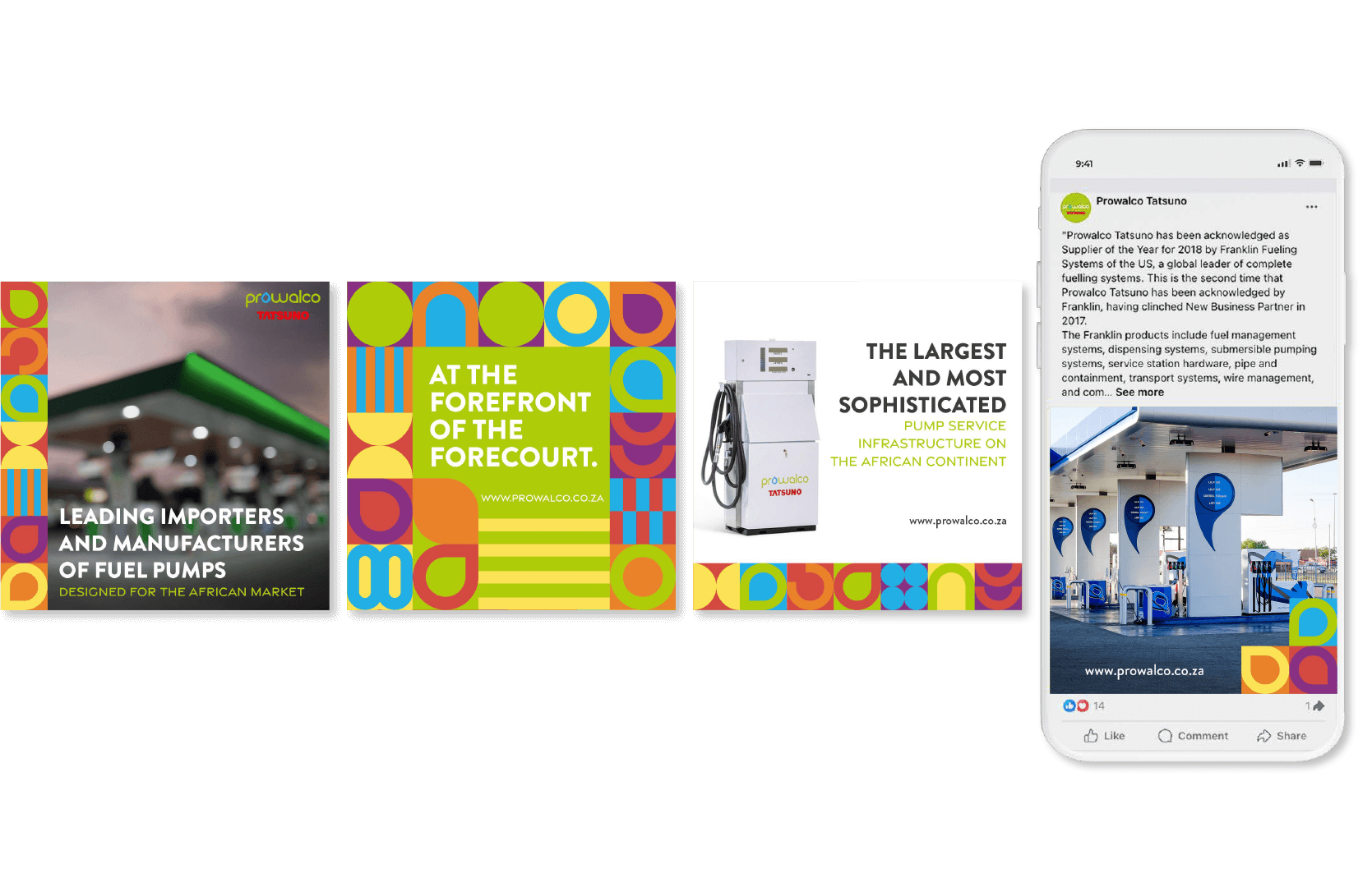
This visual style draws inspiration from the rich visual heritage of Africa, blending it with a modern aesthetic for a truly vibrant result. The design style incorporates elements that reflect the continent’s dynamic energy, such as bold geometric shapes that echo traditional textiles and patterns. Each shape within the overall pattern was created using the individual letters of the logo. The rich tapestry of African heritage informs the brand’s identity, contributing to its established presence, while this modern interpretation creates a visually striking and memorable image, perfectly suited to a forward thinking company.
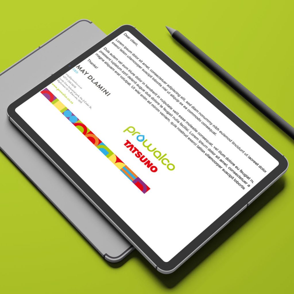
The Design deliverables reflects the brand’s innovative spirit by seamlessly blending the modern take on traditional African patterns with clean, sleek typography, for a clear and sophisticated look. This ensures the established brand continues to project a modern image through high-contrast fonts, clear imagery, and impactful pattern integration.
This design concept showcases Prowalco’s leading products and services, innovative spirit, and established presence in the modern world. All work was completed while employed by Geolix.